Sunday, February 6, 2011

Homeschool Project Lesson #4: NATURAL FRAMING TECHNIQUES


This past week I attended a travel photography seminar at my local photo store. As it turns out, not only did I learn a ton during those two hours, but I also found inspiration for this week’s Homeschool Lesson: Natural Framing Techniques.

Now, when I say “natural framing” I am not talking about putting recycled wood around your prints. I’m talking about using things in your shooting vicinity such as trees, windows, bodies, etc. as foreground frames to accentuate what you want to pop out in your photo. What you use as a frame is only limited by your imagination, but here are a few tips to put you on the right track:


1) Consider a natural or man-made frame that draws a parallel to your subject. For example: are you shooting a portrait of a young girl and attempting to portray femininity and innocence? What kind of frame would make more sense for that situation; shooting through a chain link fence or over a blossoming hedge? (Ok, this example is kind of cheesy, but I hope you catch my drift.)


2) Try to create a feeling with your frame. If we look at the example above once again, constructing a portrait of a young girl with a chain link fence as your frame creates a juxtaposed image that in turn invokes deeper consideration, a perhaps a more complicated emotion, for the viewer.


3) Play with depth of field. Do you want your subject in focus or your frame? Maybe you want both in focus…or neither. Really take the time to think about where you want the viewer’s eye to fall first in the picture.

Friday, February 4, 2011

Homeschool Project Lesson #3: STREETS & STRANGERS (Part 2)

Sorry for the delay in posting. Work work work...we all know the mantra. I did have a chance to shoot some street shots in San Diego before my conference. When I went out to the streets, I had the following mini-list of street photography tips in mind:


1) Be Observant: Look for a moment in time that tells a story. You want the viewer of your photograph to be able to interject an imagined scenario into the scene. For the picture above, I see this young couple and imagine them immersed in one another despite their very chaotic and public surroundings.

2) Be Brave: Street photography is not for the timid. You have to have in the back of your mind the possibility that you will be spotted by your potential subject and still take the shot anyway.

3) Be Respectful: There is a fine line between taking in the scene and hijacking the scene. The people you are photographing are just out there living their lives like you. Make sure you put yourself in their shoes before you take a step too far.

4)Take At Least 3: Street scenes are living, breathing organisms. Constantly changing from one millisecond to the next. You may think the shot you have is amazing but if you are sure to take at least 3 consecutive shots of the same scene you may find that something new and beautiful emerges.

Monday, January 24, 2011

Homeschool Project Lesson #3: STREETS & STRANGERS (Part 1)


Sundance has hit my city and in a couple of days I head to San Diego for the first time since I was a little kid, so I thought it might be fun to focus on Streets and Strangers shots this week for The Homeschool Project. For this assignment, I'd like just candid strangers, not street portraits (we can do that another week) but the rest is a free-for-all...color, black and white, urban, rural, crowded markets or lonely lanes. Just get out into the streets and shoot!

Thursday, January 20, 2011

Homeschool Project Lesson #2: DIGITAL BLACK & WHITE (Part 2)

So you have your pretty digital color photo shot in RAW with the lowest ISO possible. What now? If you’re like me, you import your shot into iPhoto and hit the Black and White button, and….ta daaaaa!

But wait, apparently this is not the only, nor the best, method for going monochrome. I really had every intention of writing up an amazing tutorial on different black and white techniques but then I found THIS and I thought, why reinvent the wheel? There may be one too many advertisements on this page, but if you can ignore those, the information is really comprehensive and simple to understand. You can even use some of these techniques in flickr’s post-processing program picnik.com.

So, instead of writing up a tutorial I decided to put my efforts into trying out each technique on the same photo and posting the results for you to compare. I suggest you do the same (posting them as a collage in our flickr group) and maybe collectively we can come to a consensus on what techniques work best for what kinds of shots.

Monday, January 17, 2011

Homeschool Project Lesson #2: DIGITAL BLACK & WHITE (Part 1)


For this week I'd like to concentrate on creating digital black and white photos. Part 1 of the lesson consists of me scouring the internets for tips about digital black and white photography and compiling the bits I saw repeated as important. Below you will find my list of "5 Tips for Great Black and White (Digital) Photography To Add To the Multitude of Lists Already Out There." Also, if you want to check out some really beautiful B&W shots go here.

So without further ado...

5 Tips for Great Black and White (Digital) Photography To Add To the Multitude of Lists Already Out There.


SHOOT IN COLOR: This may seem counterintuitive if your camera has the option of shooting in black & white, however, you will have greater control of your final product if you shoot in color and then convert to black & white in post-processing. One thing to note is that your camera may give you the choice to preview your scene in black & white on your LCD screen. This might help you to identify good black and white scenes, just make sure to switch back over to color capture once you are ready to shoot your final image.


SHOOT IN RAW: This may or may not be an option for you depending of the type of camera you have. If your camera will not shoot RAW images, go ahead and keep the rest of these tenets mentioned here in mind while composing your photograph. I will be sure to cover JPEGs and RAW in LESSON #2: Post-Processing Black & White.

But if you can shoot in RAW, then do it, and this is why; every time you open and close a jpeg, they loose a little data You are degrading the color and luminosity of the pixels, which reduces the image quality. Conversely, when you shoot in RAW, a large range of possible values for color and luminosity are recorded which exponentially improves the possibility of creating a high-quality black & white in post-processing.


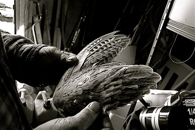
CONSIDER YOUR SUBJECT: Do you want to photograph a landscape, person, animal, street scene, architecture or abstract? Good! Black and white photography works well with all of these options and more. And though what you see in your viewfinder is very important for a successful picture, so are some of the things that you might not normally “see” unless you pay close attention. With a black and white photo you will want to be especially sensitive to the emotion you want to convey in the scene. Because you will not be relying on color to tell the story in your photo, you will need to take time to consider shapes, tones and textures in shot. Additionally, shadows and highlights can be very effective tools in black & white photography and if carefully considered, will accentuate textures, patterns and depth that may not be apparent when the photo is still in color.


CONTRAST IS KEY: Black & white photography encompasses black, white, and all the tones in between. Contrast and key are features you can emphasize or minimize in ways that are not really possible in color pictures. Capturing high-contrast (an extreme range between bright and dark) scenes may force the viewer’s eye to a specific part of the photograph, while a low-contrast (a more narrow brightness range) scene may suggest tranquility and calm. According to one website I found (that I can’t find again so I can’t attribute it to the guy that originally wrote this): “You may also hear the terms high key (predominately light tones) and low key (predominately dark tones) in relation to black-and-white photography. Contrast and key are not synonyms. A photograph may be low in contrast, yet high in key, such as a blond, blue-eyed girl against a white background.”


SHOOT FOR A LOW ISO: It is vital for black & white photography that you use the lowest ISO that is reasonable for the shot that you are taking, especially since this is the one key factor that you cannot change in post-processing. When you use high ISO the noise (graininess) will become more obvious in black & white than it even is in color. If you want your end product to have that grainy effect, you can add it in later, but it is best to start with as smooth of an image as is possible from the get go.


Your homework for the next couple of days is to take this list out into the world and shoot, shoot, shoot your little photo-bug heart out. Come back Wednesday(ish) for Part 2 of the lesson; Digital Black & White Photography Post-Processing.

Thursday, January 13, 2011

Homeschool Project #1: TILT SHIFT MAKER (Part 2)

I finally had a chance today to take a little time and shoot some photos with the sole intent being running them through tiltshiftmaker.com. I set out with my camera and the following list of pointers adapted from the website in tow:


1. Take a photo of a scene, not a close up shot of one or more subjects.

2. Make sure your scene has both near and far areas.

3. Photos taken from up high looking down at an angle or from ground level on a slope work best.

4. Start by trying to have your focus on the middle of the scene, though focusing on the top or bottom can work.

5. Seek a scene that you could imagine as a miniature or model.

6. Shoot your photo in daylight and aim for a distinct object or objects.


This list - it is a nice list. A tidy list. Straight forward and simple. And yet the task was more daunting that I had thought it might be for a couple of reasons. First off, I was in a hurry and only had about an hour to shoot before I had to be at a conference, and second, right now my city is blanketed in what I like to refer to as the “brown frown” (a nasty layer of inversion/smog) so getting a lovely sunlit shot was near impossible.

Despite the non-ideal shooting situation, I pressed on. Here are the results of two shots, one inside and one outside (in the mountains above the “brown frown”):


And here are the lessons I took away from this little exercise:

• Even though I didn’t end up with shots that I thought were spectacular, I have internalized my list of pointers and am certain that in the future I will find perfect tilt shift moment to shoot and convert with this fun little tool.

• A mediocre shot can benefit immensely from a tool like tilt shift.

• Rules are made to be broken. Many of the shots posted in the Homeschool Project group are not from above, don’t have near/far areas, are not of a “scene”, and yet they look fantastic.

Thanks so much to all of you who chose to take on the homework for this week's lesson. You all get A's for effort and B's for badassness. I'd love to hear about what you learned. What were your triumphs and “aha” moments when trying out this tool?

Also, stay tuned for next week's lesson:
It Don't Matter if You're Black & White (or maybe it does)

Sunday, January 9, 2011

Homeschool Lesson #1: TILT SHIFT MAKER (Part 1)

The first time I heard the term “tilt shift” I thought it was a function on my computer keyboard. I have since come to learn that it can be one of two things: 1) the use of special camera lenses to create in-camera the optical illusion of miniaturization in a scene or 2) the use of digital post-processing programs to take an existing photo and make it appear to be of a miniaturized scene.

For the sake of this Homeschool Lesson, I will focus on one online post-processing program for your existing photos, but if you are really interested in learning everything there is to know about tilt shift photography including lenses, popular tilt shift photographers, etc., please check out this very comprehensive list of resources: http://hame.ca/tiltshift.htm.


Tiltshiftmaker.com is a free, fun, easy to use website that lets you upload and miniature-fake your photos. You don’t even have to register. Just go to the main page, upload the photo you want to make mini, play with the sliders (don't forget the Advanced Controls) and viola! You've got you're own new little wonderland.

I would actually suggest you start out on this page: Suggestions for Choosing a Photo. It will help you select the optimal photo to send through the shrinker.

Here is a before/after version of a photo from my vacation in South America last year.


I plan to play around with the website and to make it a personal goal this week to take a new photo specifically meant to be tilt shifted in post-processing.